Typography Posters
An exercise intended to help format and design without reliance on illustration, these two posters and fictional invitation to Raytheon all create their design through type and colors alone.
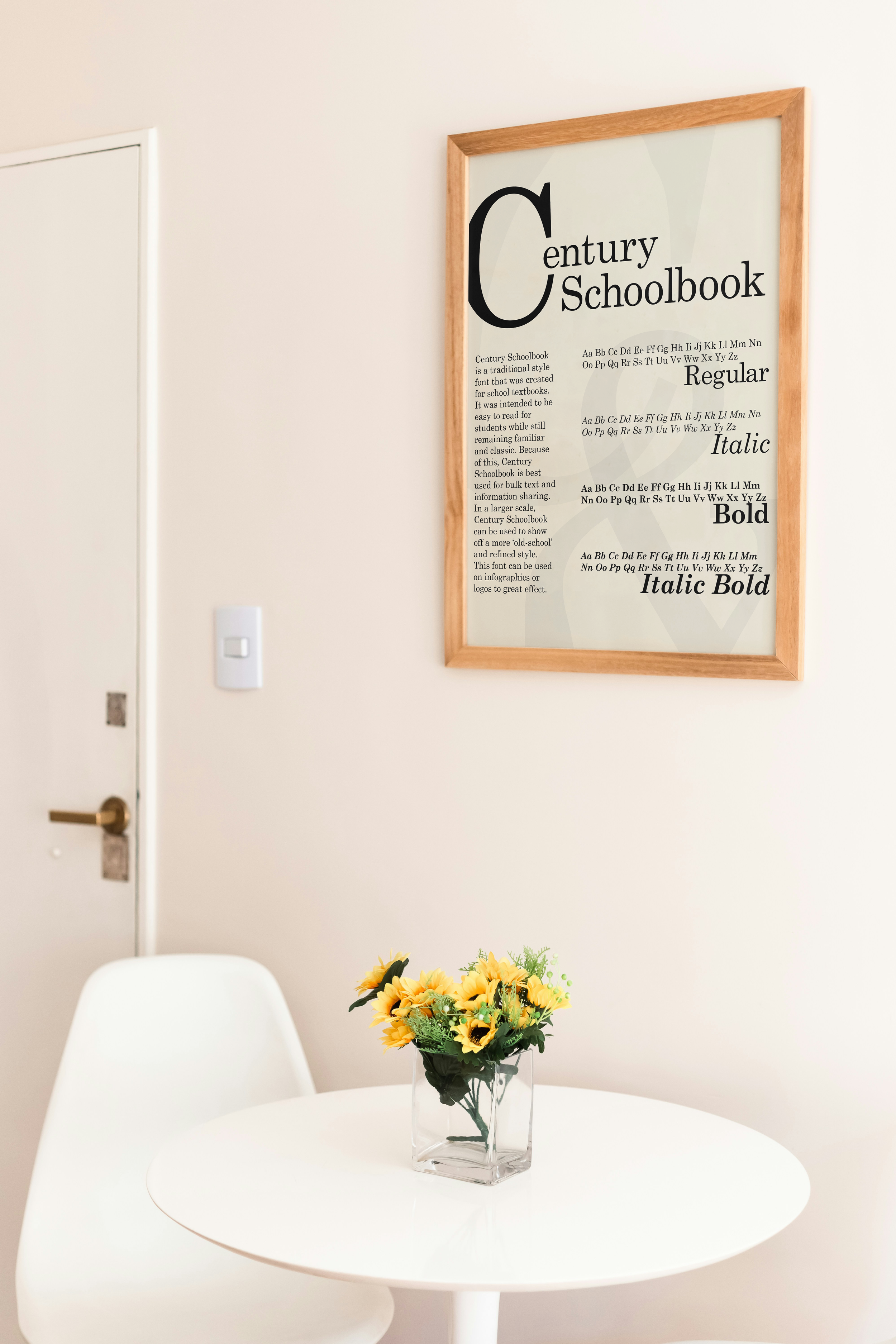
A concept for a poster based around the font ‘Century Schoolbook,’ the serif font that is used mainly within textbooks and other materials intended for learning. Because of this, the poster design is inspired by the posters that you would see in school, with colors based on aged textbooks that many would consider ‘nostalgic.’
Century Schoolbook (2024)

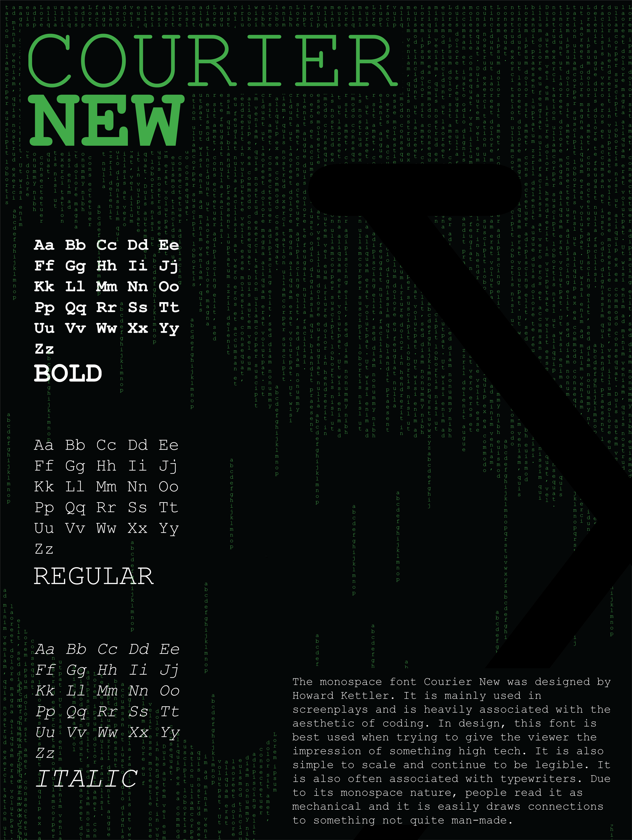
Courier New (2024)
A concept for a poster based around the font ‘Courier New,’ the serif font that is used mainly for things like screenplays or coding. It scales well and allows for simple and efficient communication between all readers. Due to its connection to coding, the design leans itself towards the well known pop culture phenomenon of the ‘Matrix.’

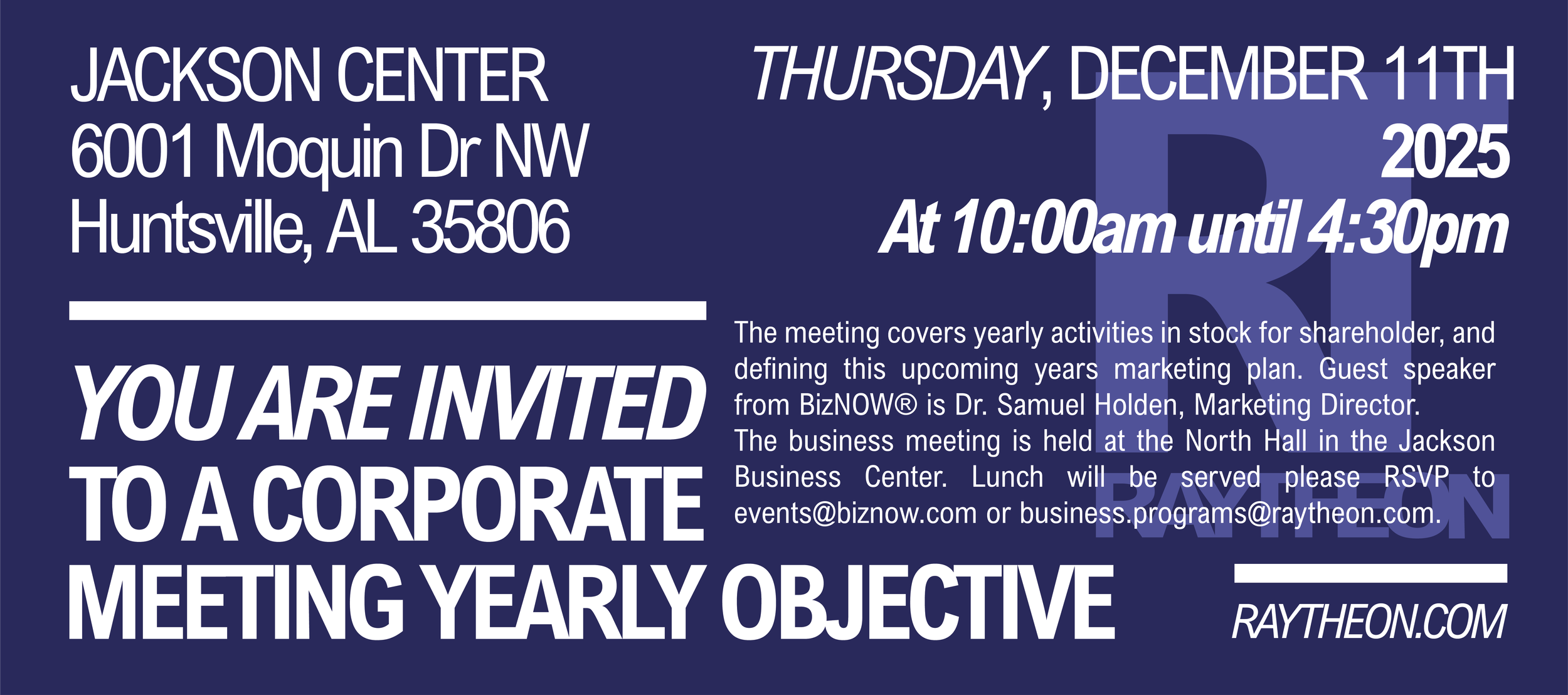
Raytheon Invitation (2024)
A concept for a new logo and event invitation for the real company Raytheon. The logo (bottom right) is intentional in creating a professional but simplistic design using the main two letters of the Raytheon name.